Thoughts on Flags, Art and a State of Perpetual Revolution
This post is about the new Minnesota State Flag, about abstract art, and about the exhausted feeling I get in contemporary politics.
The new Minnesota state flag is a masterpiece of design in accordance with the principles of vexillology. Those principles are explained in “Good” Flag, “Bad” Flag, which is largely a set of good graphic design principles invested with some sociology and insights from other disciplines. The North American Vexillological Association summarizes those principles this way.
- Keep it Simple. The flag should be so simple that a child can draw it from memory.
- Use Meaningful Symbolism. The flag’s images, colors, or patterns should relate to what it symbolizes.
- Use 2 or 3 Basic Colors. Limit the number of colors on the flag to three which contrast well and come from the standard color set.
- No Lettering or Seals. Never use writing of any kind or an organization’s seal.
- Be Distinctive or Be Related. Avoid duplicating other flags, but use similarities to show connections.
It’s hard to argue with these principles, though I will argue that they mostly treat the flag as a graphic design problem, and I want to see the Minnesota flag redesign as a sociocultural problem set worked out through the flag.
Based on these principles, we can see why an earlier, preliminary design was scratched.
For starters, it uses too many colors.
As some conservative pundits noted, the potential symbolism of the tricolor stripes was also complicated, as the design unintentionally appeared superficially similar to the flag of Somalia.
It would be hard to sell the general population on a flag design that connected Minnesota to Somalia — a violation of the vexillological principle “Be Distinctive or Be Related.” That principle asks us to “avoid duplicating other flags, but use similarities to show connections.”
So the tricolor was reduced to one, reducing the total number of colors in the flag to three, the vexillological sweet spot.
And so we have a new flag, a vast improvement over the old one, which was racist in its imagery and just plain hard to interpret. In different iterations, the flag appeared to tell a racist story of white settlers forcing Indigenous people out so that they could establish agriculture and industry. (In some iterations, the settler still has a rifle, nearby, ready to use if needed, again.)
The story therein was racist in part because it created the illusion that the Indigenous people were forced to leave, while many, many are still here. The genocidal project to eliminate Indigenous people (through violence, through “education” in boarding schools, and through ugly federal policies about blood quantum) has not been successful.
But, I think, the flag and the story it relates were racist in part because it reflects the mindset of the settlers who designed it.
If I can struggle with another way to say it: in its content, it related a racist fiction, and in its existence, it revealed a racist mindset.
The move to replace a story on a flag with a depiction of a star and a blue field (representing water and sky) is a rejection of the racist fiction and the racist mindset, which I applaud, but I’m still struggling. I think we could go further.
…
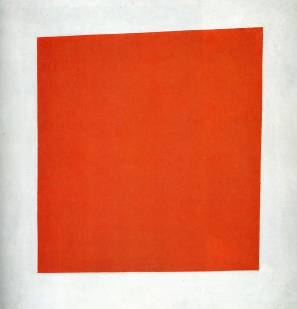
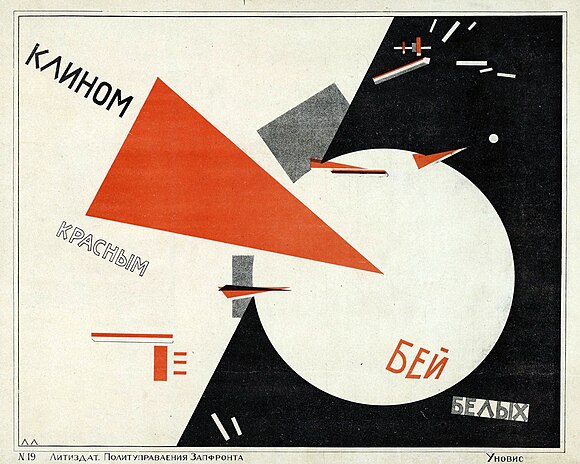
When I was younger, I loved Russian constructivists like Kazimir Malevich, El Lissitzky, and the artists who reflected revolution through abstraction in art.
As the revolution threw out the Tsar, so too, its artists threw out the cultural baggage associated with the Tsar and pre-revolutionary life. Abstraction was a visual means to break with a past that the revolutionary artist didn’t want anymore.
It worked, for a while. Art and cinema and dance and music were deeply revolutionary, and a 22-year-old me was insistent that you didn’t need sculpture that actually looked like people or animals if you had Tatlin’s Monument to the Third International. Abstract art rocked!
But what a 22-year-old loves isn’t sustainable indefinitely. (I can’t dance to Skinny Puppy the way I used to.)
Abstraction and revolution, in art and in society, are uncomfortable things that people want to pass through on their way to something more comfortable to them. For the average Russian, the goal was not perpetual revolution, but revolution followed by some kind of new normal that would be familiar. They want to break with the bad things in the past so that they can hold onto other things more tightly.
Eventually, Soviet Communism would tire of Constructivist art and return to the folk styles. Perhaps, a population is easier to control when it’s surrounded by creature comforts like art it can recognize. Maybe, it’s just impossible for most people, outside the most extreme in politics, to be in a state of persistent revolution, and so revolutionary art couldn’t churn the people up, over and over.
El Lissitzky’s attempt to represent the Russian Civil War in “Beat the Whites with the Red Wedge” (Russian: Клином красным бей белых!, Klinom krasnym bey belykh!), in a way, follows most of the principles of vexillology (except the one about using words in the image).
According to Wiki, “In the poster, the intrusive red wedge symbolizes the Bolsheviks, who are penetrating and defeating their opponents, the White movement, during the Russian Civil War.” The similarities to the design of our flag should feel easy to see. The Red Wedge is like the white star of the north, about the same level of symbolic richness, I think.
Neither El Lissitzky nor the designers of the Minnesota flag wanted to depict uncomfortable things (a bloody revolution, a bloody past), so they slipped into abstraction.
Artists and flag designers alike can choose to jettison the history we don’t want. They can choose to replace a painful history with abstractions that make a minimal amount of sense but generate no adherence across a broad population. I can’t imagine “the red wedge” set anyone afire with identification, any more than a field of light blue makes me swell with the pride of Lake Superior.
The designers of the Minnesota state flag didn’t want to misrepresent the relationship between Indigenous peoples and the settler-pioneer-colonials on the flag, so the designer erased them both and offered abstracted stars and lakes instead. The designers didn’t want even the appearance of a racist mindset behind the design, and so we have a star over some water.
But maybe we lose more than just the racism when we retreat from history like this.
The designers replaced the words “Etoile du Nord,” with an image of a star. Vexillolgy demands no words on a flag, after all. But that erasure of our motto is a loss, because Minnesota is the only state with a French motto (take that, Maine!).
Our French motto represents the significant presence of French traders and French Jesuit explorers in this region. (Some scholars have noted that those French traders were unique because [unlike Anglo-American settlers, who wanted to come and own land] French traders wanted to build networks of trade. How might indigenous-settler relations have been different if the French paradigm had been the one for settler-indigenous relations in Minnesota and the United States? For more on the relations between French explorers in this region and Indigenous people, see articles like this one about Father Marquette.)
We lose the unique and provocative and inspiring in our history so that we can erase the embarrassing and regrettable and traumatic.
Maybe I want too much from a flag. But the problem isn’t resolved much differently in our new seal.
Less abstract to be sure, but by leaning hard into natural resources, it’s still a remarkably historyless image. The lakes and rivers, grain and loon, star and hills of the image could represent the land called Minnesota in 1858 and the land called Minnesota in 2023.
I’m not advocating for the old flag. It was junk. It needed to be tossed.
But no one working on this flag was a tenth of the genius Kasimir Malevich was, and Malevich’s work (visually representing a break from the past) is respected as a failed political project clothed in some innovative art techniques.
I wonder whether our new flag is also a failed political project clothed in some less innovative art techniques.
I wonder whether we could have agreed upon any design that could invoke our history. What would that look like? What would a seal or a flag or anything other visual icon look like, if it tried to address the history that the current designs erase?
I would have liked to have seen it.
Recommended Links:
Leave a Comment
Only registered members can post a comment , Login / Register Here









5 Comments
Matthew James
about 1 year agoDavid Beard
about 1 year agoMatthew James
about 1 year agoDavid Beard
about 1 year agoMatthew James
about 1 year ago