Gunnar Birkerts and Intuitive Synthesis: The Place of the Duluth Public Library in the History of Modern Architecture
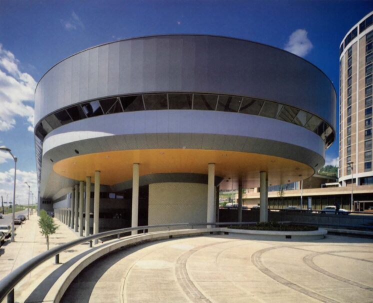
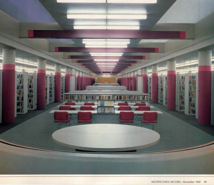
Duluth Public Library in the November 1980 issue of Architectural Record.
Last month, an article appeared in the Duluth News Tribune about the decision to demolish the Duluth Public Library and replace it with something smaller in a shared building. The reasons provided for demolition instead of restoration mostly involve challenges to reprogramming and subdivision created by structural pillars, expensive building systems like insulation in serious need of replacement, and other issues related to years of deferred maintenance.
Also within the article is a quote that stuck with me: “From the community input we’ve received so far, most of it has been to the effect of immediate heartfelt expressions of dislike for the current building’s brutalist architecture.”
Saying people didn’t like the building didn’t bother me. People like what they like. Referring to it as brutalist architecture did, because it isn’t. And that misinformation was all the article really had to say about the rather unusual architecture of the building. And that led me to think that some people might not really fully understand what was about to be torn down and that I might be one of those people. I only knew enough about architecture to know that the Duluth Public Library is not a brutalist building and not nearly enough to know what it actually is. All I knew was that it looked kind of like a ship and maybe that was on purpose.
I wanted this to be a very short article that described the actual architectural style of the Duluth Public Library. But the more I learned about its architect Gunnar Birkerts — his remarkable life, his unique design approach and process, and his place alongside the great names of modern architecture — the more I wanted to share. So this is a very long post. It does not contain any information about how to address or finance the building’s current issues. But it does contain a lot of information about the cultural and historical context of that building. And while I don’t expect that information will lead anyone to like what they do not like, I do hope it encourages some to revisit the library while they still can and see it in a different light, both literally and metaphorically.
The text below describes the early life and work of Gunnar Birkerts, his design philosophy, some examples of his work through the lens of other libraries he designed, what he created for Duluth, and its relationship to Duluth’s other prominent architecture.
Before all of that though, a note on brutalism. The basic Wikipedia definition of brutalism reads:
Brutalist buildings are characterized by minimalist constructions that showcase the bare building materials and structural elements over decorative design.
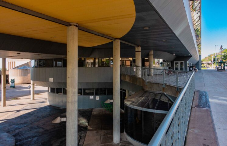
Gunnar Birkerts placed a giant yellow circle on the underside of the Duluth library as a reminder of the sun during Duluth’s long winter months. That’s not brutalism.
The Early Life and Work of Gunnar Birkerts
In the preface to a collection of Gunnar Birkert’s life work, his son, the noted literary critic Sven Birkerts (most famous for his book The Gutenberg Elegies on endurance of reading in the internet age) wrote an overview of his father’s rather eventful life. I can’t do justice to the evocative writing, but I can provide a summary.
Gunnar Birkerts was born in 1925 in Riga, Latvia, raised in a city apartment by a single mother. At the age of 19, he fled the country to escape the Soviet occupation of Latvia at the end of World War II. His mother stayed behind and because of the occupation he did not see her again for nearly 30 years. After the war, his status as a displaced person made him eligible for a German scholarship that the Allies had set up as a form of reparations, and he began studying architecture at the prestigious Technische Hochschule in Stuttgart, Germany. It wasn’t just a theoretical education but also a practical one, as a country in ruins needed to be rebuilt.
In 1949 the Latvian woman he was in love with, later his wife, left with her family for the United States. He followed her by accepting a year’s work with a North Dakota rancher who was supposed to meet him at the port in New York upon arrival. The rancher never showed, but Birkerts’ future wife was there to convince immigration to let him in the country.
Free from ranch work, he went straight to the office of his favorite U.S architect, the Finnish-American Eero Saarinen, with a letter of introduction from one of his more noted German professors. Despite interrupting a meeting with the famed architect Minoru Yamasaki, Eero Saarinen helped him secure a job. He was advanced his first week’s pay because he didn’t have enough money left for a night in a hotel.

The Gateway Arch, designed by Eero Saarinen
Birkerts worked for four years as a designer at Saarinen’s firm, an office whose innovative designs attracted the most talented and ambitious young architects of the day. Many of Birkerts co-workers would also later become influential names in the field. These included Cesar Pelli, Kevin Roche, Robert Venturi, Spero Daltas, Charles Eames, and Anthony Lumsden.
After leaving Eero Saarinen’s firm, Birkerts would go to work for the man whose meeting he had interrupted at the very start of his career, working for as chief designer for Minoru Yamasaki at the beginning of his commission of New York’s World Trade Center.
Birkerts develops his own unique approach
What he learned most from these two major architects was that their style and processes were not his own. He worked in these famous offices in the 1950s when crew cuts and conformity were accepted practice. He let his own hair grow out and never concerned himself much with trying to fit in. He respected the work that these firms produced but was frustrated by their rigidity. Saarinen relied too much on fixed processes and Yamasaki held too rigidly to modernist design principles.
Birkerts learned a considerable amount from these two famous architects but his greatest influences remained two other people. The first was Alvar Aalto, a Finnish Architect and designer who created buildings with an organic modernist style and applied a Scandinavian Modern aesthetic to their interiors. The second was his mother. She raised him by herself at a time when that was virtually unheard of and instilled in him an unwavering work ethic. And more than that, as a university teacher and one the most prominent Latvian folklorists, she taught him how our stories shape our lives and our understandings of ourselves. From her, Birkerts learned the importance of bringing local identity into his work.
Metaphor and meaning were the first principles of his design process, a framework that set him apart from nearly all other architects of the time. It also put him about as far away as is possible from brutalism, a movement that believed there was a certain honesty to be found in making no attempt to provide any sense of meaning beyond a structure’s direct literal function. As Birkerts himself stated, “Architecture must address not just the practical need for shelter, but also the human need for meaning. I consider metaphor and symbolism to be integral to my concepts.”
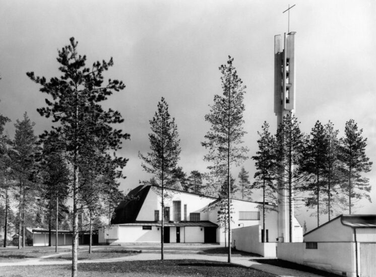
Alvar Aalto’s Church of the Three Crosses. [Photo: Pertti Ingervo, Alvar Aalto Foundation]
Throughout his work, Birkerts experimented with new materials and technologies, but he never used software in his design process, even as this became increasingly common as his career advanced. He felt he needed to draw by hand — put pencil to paper and respond in real time to what appeared. He would draw over his own work and make adjustments and corrections until a solution came forward.
In a review of his work, the Washington Post said Birkerts “used concrete, glass and steel in ways that seemed to flow, almost as if shaped by hand.”
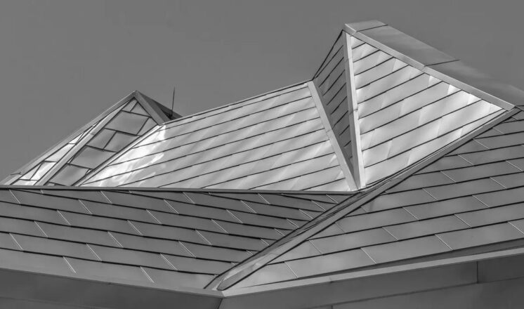
The roof of the Kemper Museum of Contemporary Art in Kansas City, designed by Gunnar Birkerts
What this meant practically is that he approached every project on its own terms. He started by making sure he understood all the needs of the client and all of the technical and legal requirements of the project. And then he looked for what he called the “intuitive synthesis” — the overarching theme that would bring a deeper identity to the work. As stated in Birkerts own words:
Globalism — the kind of design that looks past the vernacular in its search for a completely contemporary idiom — tends to remove the regional and national characteristics; it violates the essential — and distinct — context. I believe in an architecture that maintains its regional alliances. My design originates in a synthesis of practical factors and appropriate expressions. Critics have said: ‘His style is no style.’ I accept that as a kind of compliment — every one of my solutions is unique.
Or as stated by the architecture critic Kay Kaiser, “His objective is to give a building personality with an expressive outer form generated by the organic functioning of the interior. The emphasis is still on interior daylight, the exploration of materials, and physical and emotional comfort.”
As he developed and implemented this framework in his own independent firm, it received notice. A 1964 issue of Progressive Architecture took the rare step of devoting an issue almost entirely to his buildings, which were, as Kaiser described, distinctive for their “bold forms, space before structure, minimal detailing, stratified walls and daylight in interior spaces.”
While these characteristics generally reflect his work, an overarching description is hard to come by. While Birkerts was unapologetically a modernist, he rejected any sort of theoretical framework that would limit his options, stating that unified design theories “take out the spirit of invention.” As he told the Washington Post the year that the Duluth Public Library opened, “I suppose I just feel too secure to need a dogma.”
The Post noted that “Mr. Birkerts rarely repeated himself throughout his career and did not have a signature visual style, other than an ingenious ability to arrange windows and mirrors to refract light deep inside his buildings.”
Because every structure he created was unique, the only way to get a sense of his work is to examine some of his many individual buildings. Throughout his career, he built museums, banks, churches, homes, and the corporate headquarters of Domino’s Pizza in the style of Frank Lloyd Wright.
He designed schools. During the civil rights movement, he went to Jackson, Miss., to assist the historically black Tougaloo College with its plan to become “the Harvard of the South.” His 1965 design for Lincoln Elementary School in Columbus, Ind., constructed 25 years before the passage of the Americans with Disabilities Act, was the first in the nation to provide access to every part of the building for people of all physical abilities. It won the 1970 Bartlett Award for buildings designed for use by the physically challenged. Its opening was dedicated by Ladybird Johnson, the current first lady, who said stated in her speech, “It is said that architecture is Frozen Music, but seldom in history has such a group of devoted artists produced such a Symphony in Stone as presents itself to the eye in Columbus, Indiana.”
And he was responsible for the design of eight libraries. Before discussing the significance of the Duluth Public Library in his career, therefore, it might be helpful to look at some of the other libraries he built, and what they have meant to the communities in which he built them.
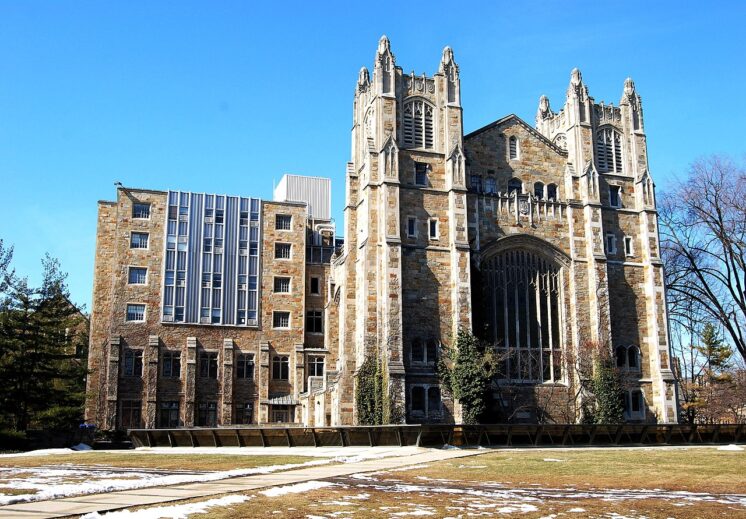
The University of Michigan Law Library Addition, Ann Arbor, Michigan 1974–1981
Adapted from James Tobins’ The Law School Goes Under
When the University of Michigan Law School ran out of space for its books, it held a competition for an expansion of its neo-Gothic styled law library. The finalists came down to two architects. The first was I.M. Pei, the famed architect behind the pyramid in front of the Louvre in Paris and the expansion of the National Gallery of Art in Washington D.C. The second was Birkerts. The committee liked Pei’s design better. Birkerts’ entry was interesting but a bit unclear.
Before they made their final decision, however, they paid a visit to a building that each architect had already built. They went to visit Pei’s John Hancock Tower in Boston and found some of the windows had fallen out. And they were told that if Pei was chosen, they would see him exactly twice: when they approved his design and when they cut the ribbon.
When they went to examine Birkerts’ black granite addition to the Detroit Institute of Arts, they were “assured that Birkerts himself would be on hand for every sweaty stage of the process, making sure of each detail.” Birkerts got the contract.
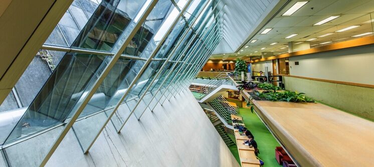
He proposed a structure two-thirds underground and one-third above ground. Just as in Duluth, the University of Michigan had a number of critics of modern architecture, and when they saw what the above ground section would do to the view of their beloved Gothic library, they objected forcefully. Birkerts listened, adapted, and came up with a new proposal: an entirely underground structure. This was deemed to be more insulting. The law students did not want to be relegated to a basement to work in the dark. Birkerts consistently gave the same response to this new round of criticism: “It will not be dark.”
His design involved an enormous window at the bottom of a exposed trench, an issue that came up in a tense meeting about the feasibility of his proposal. A faculty member asked, “What will happen if a student throws a rock down into the trench.”
Birkerts answered simply, “Strong glass. It will not break.”
The faculty member pressed on, asking the same question but with a heavy construction sawhorse instead of a rock.
Birkerts answered again, “Strong glass. It will not break.”
So the professor tried again: “What if somebody drove a car down onto that glass?”
Birkerts took a ten-second pause before replying with a straight face, “It would break.”
The plan was finally approved, but the chair of the building later recalled that everyone’s expectation was that “it would be a terrible, botched mess … and we would be the laughingstock of the world because we had spent such a huge amount of money on a dim, unlit, horrible, sweaty building.”
When it opened, all those fears were immediately laid to rest. The space was not just filled with natural light all the way down to its lowest level 54 feet below ground. Mirrored dividers within the gigantic sloping windows refracted that light, creating kaleidoscopic images of the Gothic building above that now appeared twice as tall from deep below the surface. As stated by Birkerts, “It makes a sort of icon of the mother building.”
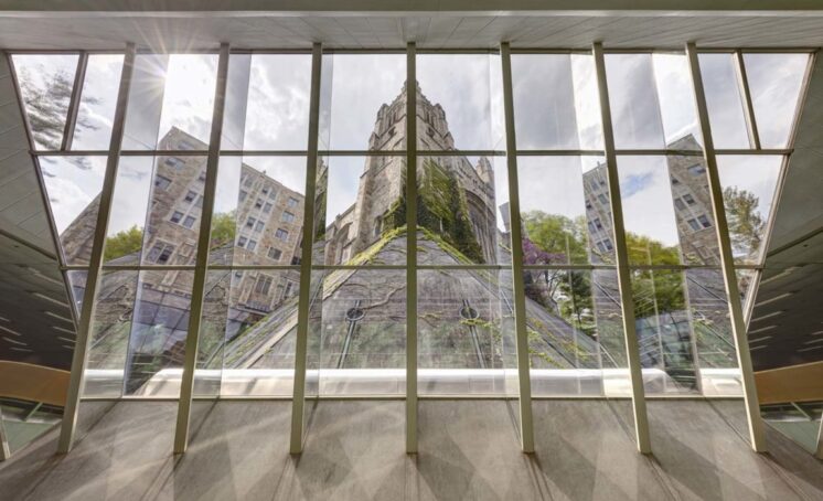
The main library from below {Photo: James Haefner]
The Journal of the American Institute of Architects called it “probably the most aesthetically satisfying large underground building to have penetrated American soil.” In an interview years later, the same committee member who was filled with doubts over the design of the building remarked, “It just shows our incapacity to visualize these things, and the greatness of Birkerts as an architect. I hope that we helped a little, but we — I’m speaking for myself — I do not think we had any idea.”
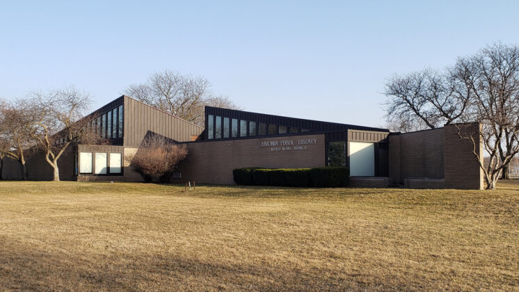
The Alfred Noble Library in Livonia, Michigan (1967)
This branch library in Livonia, Mich. bears little resemblance to the Duluth Public Library. Built just five years into Gunnar Birkerts career as an independent architect, it is a more modest structure than the ones he designed when his renown allowed him the funding and freedom to take on larger and more ambitious projects. Still, it is undeniably a design by Birkerts in that it features two of his primary characteristics: it plays with natural light and looks like nothing else that he designed before or after. It features two angled peaks of different heights near its center and sloped roofs that bring in beams of natural light above the bookshelves. An architecture magazine referred to it “as a spot of culture in a rapidly expanding, nondescript suburb just outside Detroit.”
What it has most in common with the Duluth Public Library is that it is about to be demolished. In 2019, deferred maintenance led to a water leak that created non-toxic mold problems. The library closed while the city worked to address the issue. But then in October 2022, the city declared the building “functionally obsolete” and announced that it would be torn down and not replaced. The mayor stated that library system needed to adapt to the current needs of patrons, which, according to the mayor, meant distributing the library funds to fewer locations and creating more opportunities for people to access resources remotely. “We as a city want to look at how we advance our library system to make sure we’re keeping pace with the challenges people are facing today … We absolutely are trying to make the libraries more relevant.”
The people in the neighborhood with the branch library did not feel that their library would become more relevant by being torn down. Despite the insistence that people now used libraries less and in a different ways, circulation of materials in Livonia had gone up dramatically over the past five years and the community pushed back. They didn’t understand how so much effort and money could go into turning the old Detroit train station into a cultural center but it wasn’t possible to perform basic maintenance on a local library with architectural and community significance. As one resident stated, “It was the city’s own lack of maintenance that caused the problem.”
The community has formed a nonprofit organization to save the library. The website features a compilation of residents describing what the library means to them and why they want it saved. As one person involved expressed, “It’s important for us to protect the architecture and culture that this building brings to our community.”
Residents organized what the National Trust for Historic Preservation calls a heart-bombing, a public display of appreciation for a historic place. They gathered along the street holding signs with messages such as “Less neglect, more respect,” and “We love Noble.” As one woman present stated, “It’s the only thing that has any history or noteworthy design for the entire length of Plymouth Road.”
If you are a fan of Gunnar Birkerts’ work and want to help a community save one of his libraries, you can sign the petition at change.org.
The Latvian National Library
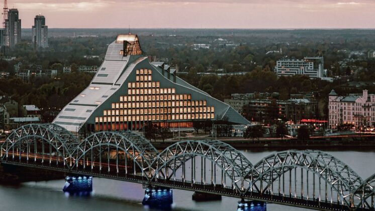
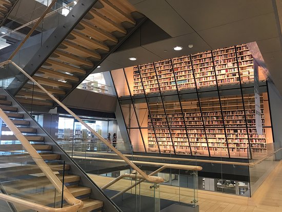
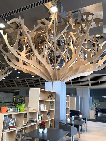
In 2017, Gunnar Birkerts Architects won the American Institute of Architects Library Building Award, an award given to architects who have created library designs that reflect the evolving role of libraries in their communities. The award was given for his final project, the Latvian National Library. They called it “ a contemporary Modernist masterpiece.”
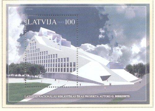
For Birkerts, it was his final project and his most personal. Having left Latvia as a teenager, the project allowed him to implement his architectural philosophy of meaning and metaphor just a few miles from his childhood home. Rather than working to understand the significance of other people’s stories, his final project incorporated the stories of Latvian folklore that he had learned from his mother. The massive structure, crowned with a glass pyramid, reflects the ideas of wisdom and freedom as told in an old Latvian folktale about the Castle of Light and the Glass Mountain.
In order to move the books into the new library, 14,000 Latvians showed up to bridge the distance between the two buildings, passing the books from hand to hand from the old structure to the new one.
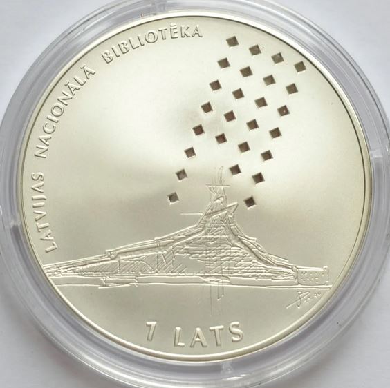
Returning to Latvia frequently to oversee the project, he rediscovered his country of birth. And they rediscovered him, holding a major exhibition of his life’s work and embracing the library as a symbol of the city by placing an image of it on a commemorative silver coin and postage stamp.
The Duluth Public Library
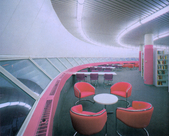
Birkerts design for the Duluth Public Library came at the height of his career. His design for the Federal Reserve Building in Minneapolis, a bank with the same supports as a suspension bridge, had brought him international attention. When the Duluth Public Library opened, it received a five-page article in the November 1980 issue of Architectural Record (most of the information below is taken from that article). A year later he won the Brunner Prize from the American Academy of Arts and Letters, which described him as “one of the most talented architects in this country today. His works display a rare combination of craftsmanship and poetic spirit.”
It might seem unusual that a prestigious architect at the height of the demand for his talent would take on a Midwestern library building as a project, but Birkerts always preferred having a small number of commissions that allowed for as much direct involvement as possible. It’s likely that he agreed to design the Duluth Public Library because of its proximity to the Minneapolis Federal Reserve Building, as the time periods overlapped. These would be the only two buildings he ever built in Minnesota.
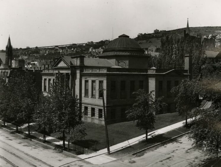
His work on the Duluth Public Library actually began in 1969. In 1966 a study on the Carnegie Library, the neo-classical building at 101 W. Second St. that had been Duluth’s main library since 1902, found that the building was “outmoded, outdated, inefficient and uneconomical to operate.” The city needed a larger, more accessible building that could accommodate the library’s growing collection.
Birkerts’ firm received the contract. He began with the idea of motion. The new library site was located next the Union Train Depot which had just ended passenger service. His first idea, one that he liked enough to recount in multiple interviews, was to put the library on the train tracks. He saw Duluth’s long, narrow form along Lake Superior and the St. Louis River as an opportunity to create a library that would be at everyone’s front door once a week. He also understood that implementing that would not actually be possible.
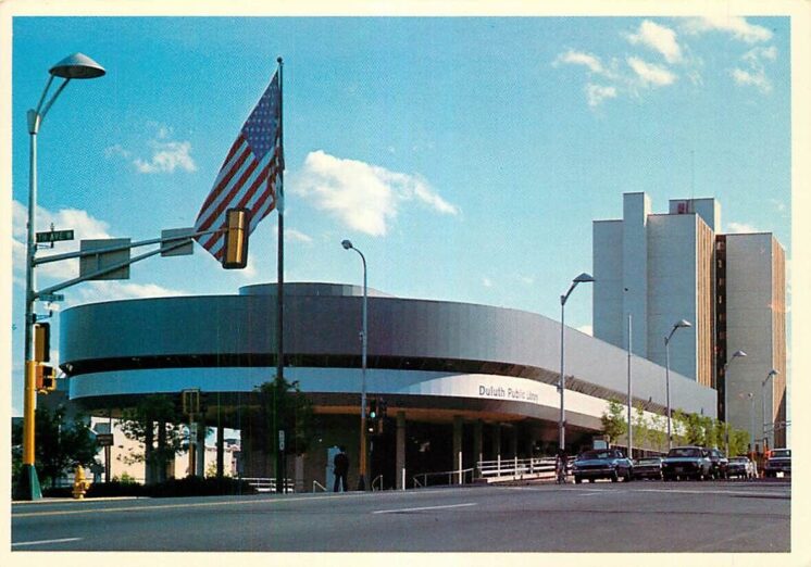
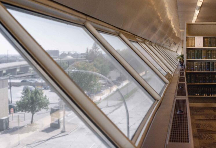
The image of motion stayed with him though. He deliberately modeled the building after the lake freighters in the nearby harbor, creating a floating quality through a stepped structure with inward slopping windows, a long overhang, and grey color scheme that gradually darkened toward the top of the building. Birkerts chose grey rather than the traditional red color of an ore boat because he felt it reflected the quieter color of a foggy day near the lake. He balanced the somberness with a giant yellow circle on the underside of the overhang as a reminder of the sun on those grey days. Always an innovator, Birkerts used a series of 30-inch insulated steel panels covered in polyester enamel finish to seal off the building from the elements even in storms that might pelt the building with horizontal rain.
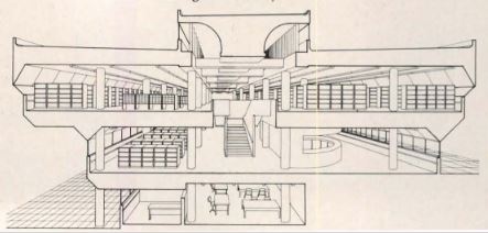
For the interior, Birkerts drew on his considerable skill in shaping natural light. The tilted windows don’t exist only to enhance the metaphorical theme. They are designed to combine with both exterior and interior panels to refract the light, flooding the space with natural light from multiple directions while at the same time diffusing it to create a watery quality in a building made for a port city.
Some of the gestures toward regional identity were very literal and practical. The North Shore Room, a place to collect and preserve regional history, was part of the original design. In nearly every history-related question that I am trying to answer on Perfect Duluth Day, there comes a point where I have exhausted what the internet can tell me and yet I know exactly where the answer is: inside of that room. People often assume that everything has been digitized but, when it comes to local history, so little really has. A good amount of Duluth history is still being held physically within the walls of that expansive library.
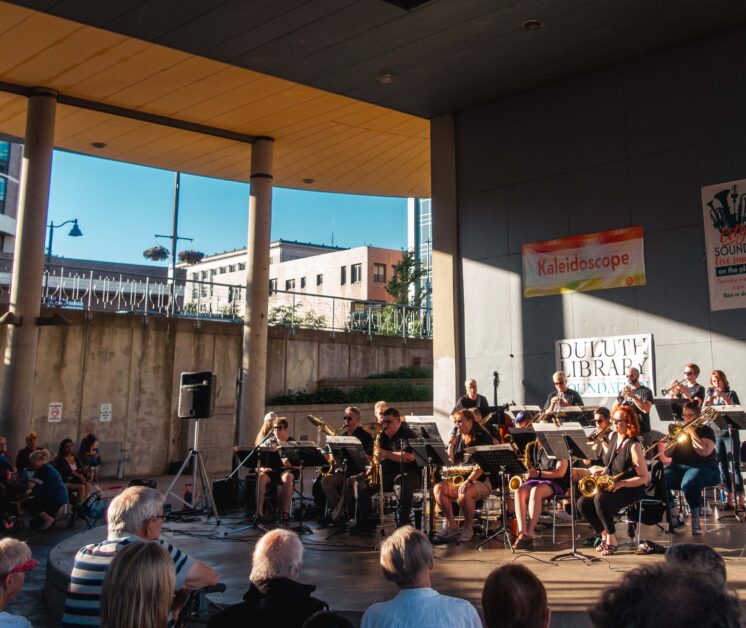
Of course, Birkerts considerations went beyond retaining local history. The library contained spaces for studying, reading, watching films, browsing music and borrowing art. My motivation to create this post comes from an appreciation for how much the spaces of that building, and the people who work in it, enriched my childhood. Year round, once or twice a month, I would walk with my family from our home in the East Hillside and explore the library, finding discoveries that still stay with me today: The Music Man soundtrack on vinyl in the records section, Field of Dreams on VHS, Laurel and Hardy’s The Music Box on film to be watched in the library itself, games of Battleship with my sister, compilations of The Far Side and Peanuts, and rotating columns of Choose Your Own Adventure books. And in the summer, timing our visits with the concert series in the plaza, I would listen to big band music next to a stack of books waiting to be read. Even if I did not understand Birkert’s design as a child, I definitely enjoyed it.
If there is one aspect of Birkert’s design that I did intuitively understand, it was the deliberate separation of the lighter and heavier works. All the of material described above was on the main floor; non-fiction, reference, local history and newspapers were all above. It was the much quieter space above that I would have to go to in order to find my parents and it always both intimidated and awed me. The downstairs provided a lot of entertainment but I always knew there were serious things to be learned on the floor above.
Of course a lot of the library spaces have been reprogrammed and years of deferred maintenance have taken their toll, but that large building, deliberately stretched out across the block like Duluth is stretched out along the water, still invites exploration and discovery. Birkerts tried to create a space that both reflected Duluth’s identity and would serve its citizens over the long term: “Allegiance to history and culture, and not simply the mode of the day,” he told Blueprint magazine in 2014, “is essential to the lasting quality I strive for in my architecture.” You can listen to audio of Birkerts himself describing his ideas for the Duluth Public Library during five minutes of a 1982 guest lecture at the Ball State College of Architecture (his description during his opening slide seems to omit that people live west of the Point of Rocks, but otherwise it fits with what is described above). The portion about Duluth starts at 1:25:10.
The National Register of Historic Places is designed to help in the preservation of buildings that are “significant in American history, architecture, archaeology, engineering, and culture and which possess integrity of location, design, setting, materials, workmanship, feeling, and association.” The Duluth Public Library would seem an obvious addition, as nearly all of those principles were central to Gunnar Birkert’s design philosophy. Most buildings on the register are more than 50 years old, but they don’t need to be. In 2013 the 44-year-old structures at Bald Mountain Recreation Area were approved for the National Register of Historic Places because, as stated on their Wikipedia page, they are “the only recreational facilities designed by world-renowned architect Gunnar Birkerts.” Not everyone seems interested in undertaking that preservation effort, however. Certainly no one is required to like any particular piece of modern architecture, but it might be worthwhile to take a closer look at a few of the reasons some people don’t like this one.
Modern Architecture in Duluth
In 2015, four years before his death, a journalist from Duluth called the 90-year-old Birkerts to let him know the city was considering demolishing his library. Birkerts explained that the issues with the building were exactly what you would expect from years of deferred maintenance and resolvable. The journalist informed him that people in Duluth just didn’t like the building and wanted to see it taken down. He said he wasn’t aware of that happening with any of his buildings before and then responded:
I would say that’s a little bit their loss, because my buildings have become a collector’s item around the country. That’s one of my favorites, too, the Duluth Library, because it has the metaphor and the symbolism and all these things that I like to work with, and so it’s sort of an expression of time and also my thinking at the time. So I’m sorry. If you live long, you see your buildings go, disappear before you do. It’s terrible! … Well, I’m glad to talk to you, and let me know how it works out. Tell them that I’m not angry, that I’m not furious [laughs], that I talked to you, but I still have some reservations about their attitudes. But that’s something else.
I wish I could share some of the reactions people had to the library when it first opened. These can almost certainly be found in issues of the evening Duluth Herald and the morning News Tribune form the early 1980s, but those newspapers aren’t available online. Finding those reactions requires going to the extensive microfilm archives in the Duluth Public Library and I’m at home in front of a computer.
But however people felt about it then, the current reporting says that people don’t like it now.
A comment on a Perfect Duluth Day post from 2017 noted that Curbed magazine placed the Duluth Public Library in its first article of a series that explored “eye-catching examples of progressive American architecture that remain underappreciated and misunderstood.”
Perhaps it is underappreciated just because Duluth has so little modern architecture to compare it to. Tony Dierckens and Maryanne Norton recently published Duluth’s Grand Old Architecture, 1870-1940. The range of years is telling. It’s not volume one of two. 1940 is not a dividing point between two equal sets of notable Duluth architecture.
Birkert’s library is arguably the most significant building to be built in Duluth in the past 80 years. When it comes down, it’s not clear what would be be left in include in a second volume of Duluth architecture. UMD continues to expand and has some notable buildings, including Weber Music Hall, designed by Birkert’s old colleague Cesar Pelli. But the UMD campus, with it’s labyrinth of interconnected buildings on the top of the hill, is a very separate place from the commercial and civic spaces of Duluth’s downtown, where the remains of the grand old architecture still seems to set the tone.
And some people don’t like how the Duluth Public Library interferes with that older architecture. It blocks the view of the Depot, for example. But it is worth noting that the depot was scheduled for demolition at the time the new library site was chosen. When the building was saved from demoliton, the large overhang on the front of the library and the plaza below were modified several times specifically to increase the visibility of the Depot from Superior Street (and the grey color, in addition to its metaphorical qualities, was chosen to align with the grey of the Depot roofs – Birkerts originally proposed a bright, bold blue for the exterior). The success of Birkert in giving the Depot visibility might be better appreciated with a photo of how the Depot appeared from Superior Street before the library. And the photographer was on a ladder.
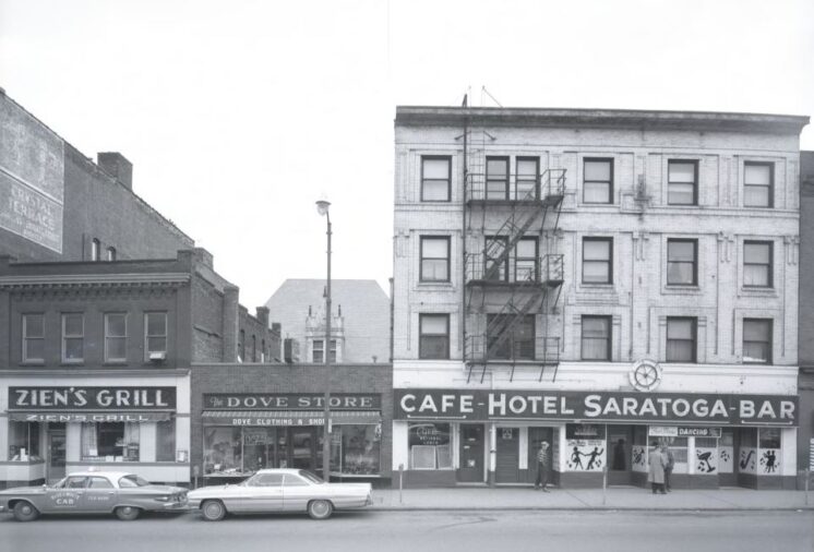
The view of the Depot from Superior Street in 1963
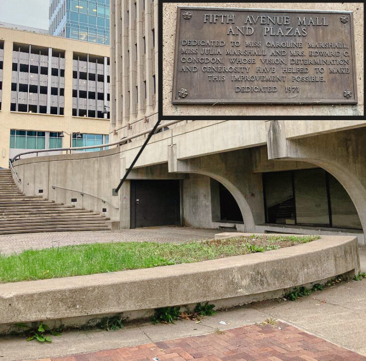
And Birkerts appreciated the local architecture himself. In addition to the library, he designed the Fifth Avenue Mall, the tree-lined boulevard that connects the Depot with the Civic Center, creating a direct link between two historic spaces (this space was also in the news recently, with the city planning to sell the public plaza next to the Ordean Building for retail development).
Even with these efforts, the Duluth Public Library just doesn’t seem to fit with downtown. In many ways, the relationship between the Duluth Public Library and downtown is similar to the relationship between the University of Michigan Law Library and Birkerts’ expansion. In his design process, Birkerts agreed to remove the above ground portion because so many in the community objected to how it interfered with the English Gothic Revival architecture of the older building.
One of the committee members, a man from England who supported the removal of the above ground structure, later had a change of heart. He reflected, “When you’re looking at the architectural beauty of the Law Quad, you are looking … at derivative art. The people who built this said, ‘We do not have anything [architectural] that we think is worthwhile, so we’re going to copy something from England three or four centuries ago. When you go down there [into Birkerts’s addition], you are looking at a proud, wonderful expression of contemporary American skill, architectural design and taste. And to me that is slightly more authentic.”
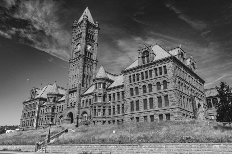
Duluth’s most notable architecture consists of styles from other times and places brought to Duluth. The Depot takes its inspiration from barns in northern France. Old Central High School is modeled after the Allegheny County Courthouse in Pittsburgh, the second most imitated building building in the United States after Independence Hall and itself a hodgepodge of European styles. Duluth’s old Carnegie Library looks exactly like what one would expect a library to look like if only because Carnegie funded the construction of 2,509 libraries around the world.
The Duluth Public Library isn’t a style brought from somewhere else to Duluth. It is a style made for Duluth. It is Duluth architecture. It’s not like the Mariner Mall where you might stumble upon some nearly identical clone on the other side of the state. There is no other library like it anywhere. It exists as a representation of the evolving design process of a world renowned modernist architect working in collaboration with the city to create something for the city and there is just one.
In order to demonstrate their commitment to curating and preserving knowledge and fostering a sense of community, cities both in Minnesota and around the world over the past few decades have made significant investments in large signature libraries that reflect their unique local identities. For a number of reasons, Duluth’s new multipurpose facility will take a different direction and not be a part of that trend. But 40 years ago, Duluth led it.
Recommended Links:
Leave a Comment
Only registered members can post a comment , Login / Register Here






7 Comments
Dandolp
about 1 year agoMatthew James
about 1 year agoRamos
about 1 year agoTony D.
about 1 year agoKodiak
about 1 year agoGhist1
about 1 year agoMatthew James
about 1 year ago