Selective Focus: Shawn Stigsell
This week we feature work that you’ve probably seen around town recently, but may not know who was behind it. Designer Shawn Stigsell has been busy with some fun projects, and he tells us a little about his story, and the stories behind these designs.
SS: I have been working with digital print since 2002 when I attended UMD. A few years ago I lost my job as an editorial designer due to budget cuts. Needless to say it was the best thing that has ever happened to my career. I have grown as a designer since then. Being a freelance designer is challenging because you have to be able to take on the valleys of the grind and time between each project. The biggest reward is seeing that the handwork is paying off by the satisfaction of clients.

2019 Gaelynn Lea Ordway Poster
Print
Gaelynn Lea and I have grown together, she as a musician and me as her designer. I was slightly intimidated to design this poster when I found out The Current was putting this show on at the Ordway Center for the Performing Arts. As a designer, we all seek that moment of exposure on a high-level; and I knew this was a special project. The biggest challenge was to integrate the images of the artists with the overall design of the poster. Gaelynn and I collaborated and came up with this beaut.
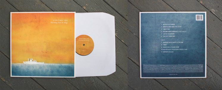
2018 “Learning How to Stay” Vinyl art
Print/Packaging
While designing this I learned that “Learning How To Stay” is about taking life with a grain of salt… to appreciate everyday that we have on this earth and not to take things for granted. Most importantly (to me) it is about being adaptable from lives hardships and not to get anchored down with them. It is about taking those hardships and seeing the positivity on future horizons.
 You can see some of my work floating around Duluth. I recently collaborated with Blacklist Brewing on their Homegrown can and I do most of Gaelynn Lea’s art. Nationally, I am contracted to design two monthly publications: Rock&Gem and COINage of Beckett Media based out of Dallas, TX. My work can also be found on my website: stigsellcreative.com, facebook.com/stigsellcreative or stigsellcreative on instagram.
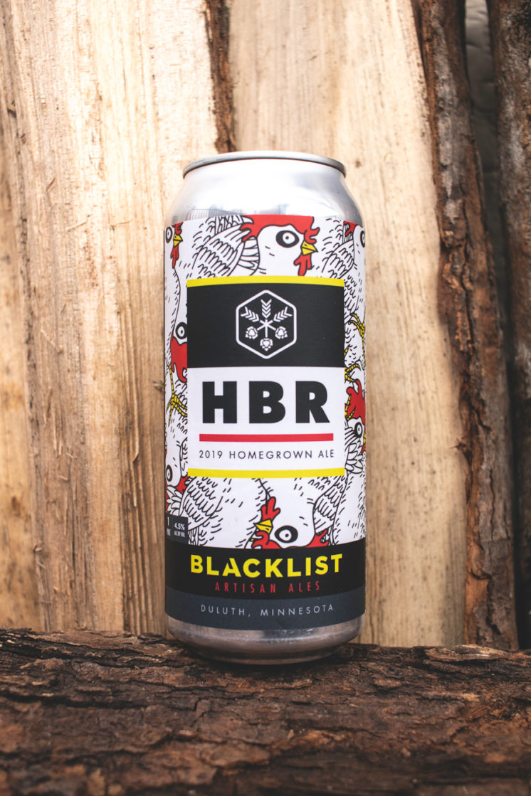
2019 Blacklist Homegrown Can
Print/Packaging
I collaborated with Blacklist Brewing on creating a can design that showcased the Homegrown Music Festival. Brian gave me the can template, the homegrown logo and told me to run with it. Most of Blacklist can designs are based off of patterns. I used the Chicken as the pattern. The repeated chicken pattern represents all of the attendees hopping from venue to venue and just pretty much puts the feeling of the festival on to a can. Note: I did not design the Homegrown chicken logo and I did not design the branding of the Blacklist can. I designed the pattern.
I am currently designing an emblem/identity for Duluth’s polka-punk band, “Winzige Hosen”
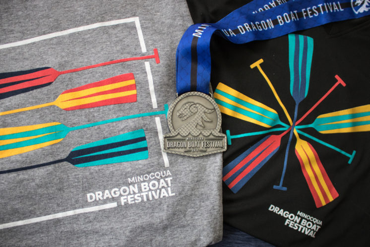
2016 Minocqua Dragon Boat Festival Design
Print/Medals
In 2016 I was asked by the Howard Young Foundation in Minocqua, WI to brand and create the signage for their inaugural dragon boat festival. The Howard Young Foundation is a non-profit that raises money for the local area hospitals. When researching dragon boat festivals most had an asian vibe. Being from the north I felt that it was fitting to take the approach of giving this festival more of a Norse style. I based the logo off of the dragons that were on the Viking ships. My objective was to make this clean, simple and have it stand out when put next to other dragon boat festivals.
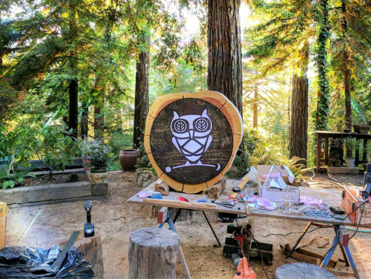
2017 In The Tree Apothecary
Illustration/Print/Packaging/Signage
In The Tree Apothecary, is a small Sonoma-grown business that offers handmade and heartfelt herbal medicine. Sonoma County, California is surrounded by the majestic beauty of the towering redwoods. The goal of branding “In the Tree Apothecary” was to take the elements of Sonoma County and combine them with the feeling of old-time medicine.
Recommended Links:
Leave a Comment
Only registered members can post a comment , Login / Register Here




No Comments