Mapping Inequality in Duluth

Mapping Inequality in Duluth

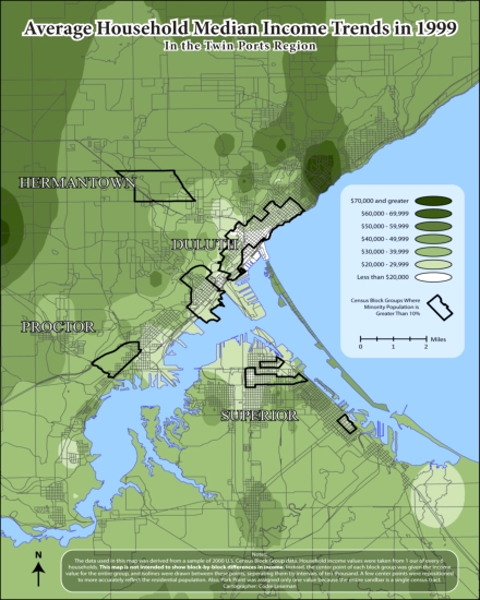
Hey everyone! This is a map I made in college a couple years back that shows patterns of income and racial segregation in Duluth. I have been going through all the files on my computer and figured the fine folks at PDD would appreciate this one. If you want to see more, I have started a photoblog: http://codiemaps.wordpress.com. I will try to post something new every couple of weeks. (Spoiler: My next map is a pseudosociological breakdown of Minnesota’s core regions.)

52 Comments

Claire

about 13 years ago

I'd love to know how you researched to obtain the information that led to your map. Pretty fascinating stuff.

Rob

about 13 years ago

Thanks for posting! I'd love to know your research methods as well.

Iron Oregon

about 13 years ago

I love maps and this is a very nice one. However, I'm not sure I'd label it "Income Inequality in Duluth/Superior." I'm as socialist as anyone but ... "income inequality"?

conrad

about 13 years ago

This is great. It would be interesting to see how 2008 changed this data.

john

about 13 years ago

This data is 12 years old?  What did you do with the findings other than create the map (which is well done btw)?  Can't you just drive around town and discern the same conclusions?  (These remarks were not meant to be as snarky as they appear).

adam

about 13 years ago

The data you are looking for can be found at census.gov. There are many different tools, views, screen, and mapping tools that be used to harvest data -- hours of fun for the statistic and sociology nerd.  

As a librarian instructor I like to make it a point to compare household incomes and educations between North End, Billings Park, Hillside, Lester Park, Spirit Valley, and then Madison, Minneapolis, and Wayzata -- this gives students a many different views of social classes and perceptions of poverty and wealth.  Great for discussions.

Codie

about 13 years ago

Yep! I got the data from the census's own website. I made it in 2009, so I was a year shy of getting the new Census info. To answer John's question, this map was for my Geographic Information Systems (GIS) class, so the main part of the assignment was just creating the map itself.

Basically, I took a census shapefile that has Duluth broken down into "Census Block Groups." Then I took the middle point of each group, and had the computer calculate the areas between each point (think of temperatures on a weather map, for example). For a detailed illustration of my work, check out this PowerPoint and click "Click here to start download from MediaFire."

In response to Iron Oregon's question, can you suggest a better term to use than "income inequality"? I thought it seemed most suitable, especially considering the stark contrast between some of the neighborhoods.  And all "inequality" means is not being equal. If incomes were perfectly equal, the map would just be one color.

Claire

about 13 years ago

How about "Socio-Economic Reality in Duluth"

jake

about 13 years ago

I grew up in the middle of that dark green blotch.  Booya!

Paul Lundgren

about 13 years ago

It seems like one flaw is that Canal Park is white, indicating people who live there make less than $20,000 per year. This must be because few people live there and that screws up the numbers. The handful of people who do live in Canal Park, in condos, make way more than $20,000. The same might also be true of the downtown business district.

Claire

about 13 years ago

Those condos in Canal Pk and in downtown are pretty recent, though, perhaps filled by dwellers after Codie did his research? I have a friend who lives in a condo atop the Sheraton. Oh... my ... god. If only.

Paul Lundgren

about 13 years ago

Good point, Claire. In 2000 there was probably one guy living in Canal Park, maybe in the basement of the spring factory, who brought the whole neighborhood down.

Iron Oregon

about 13 years ago

How about using the title you have on the map - "Average Household Income Trends in 1999." To say 'inequality' implies some ideal that everything should be equal which is unrealistic. Compared to most cities, I'd guess that Duluth has less difference between the lowest income household and the highest.

Iron Oregon

about 13 years ago

One other quibble is how does this map show "racial segregation"? Aside from those nitpicky items, I love the map and would love to see more. (the BWCAW entry map is simple yet incredibly useful!)

Barrett Chase

about 13 years ago

I'm surprised by the minority population in Hermantown. What's the story there?

Codie

about 13 years ago

Paul, very good point! I bet the map would look different now using 2010 Census data. Still, though, it seems that the number of low-income and no-income people living downtown (in the Tri-towers, Gateway tower, and all the row housing) is still significantly higher than the number of people living in upscale condos. Also, Canal Park is in the same Census Block Group as the west half of "old" downtown, which is probably another reason why it appears to be so low.

Iron Oregon, I definitely see your point. I just feel like saying Mapping Inequality in Duluth is much more eye catching than the generic title. Plus, it's shorter too, so it only takes up one line.

Barrett, I don't know if there is a "story" behind it lol. But that chunk you're referring to is mostly in the Duluth Heights neighborhood actually, not Hermantown. I just set the parameters to highlight any census block group that has less than 90% white people, and that is what the data showed.

jessige

about 13 years ago

Is that Hermantown minority section over the airport?  (I'm bad at maps w/o street names.)  I have no idea if that's relevant or not, but...

Codie

about 13 years ago

I should probably add street labels to this map at some point. I know it can be hard to read without them, unless you're a total nerd like me. The default GIS labels just looked so crappy that I couldn't bear to leave them on.

But, in response to your comment, Jessige, that area is actually mostly over the Duluth Heights neighborhood. It is a single census block group bordered by Arrowhead Rd to the North, Maple Grove Rd to the South, Swan Lake Rd to the East, and Haines Rd/Hwy 53 to the West.

adam

about 13 years ago

The U.S. census website is particularly useless, cumbersome and non-dynamic at first glance.

I wish that Zip Skinny would update with 2010 info.

Les F

about 13 years ago

Referencing earlier remarks about Hermantown, try this and zoom in on Hermantown (data is 2010).

http://projects.nytimes.com/census/2010/explorer

wildreed

about 13 years ago

My first thought was that the Hermantown minority area must be because of the inmate population?

dbrewing

about 13 years ago

There are apartments above the Green Mill and some others above the buildings next to the Toga. The residents of these are far from wealthy.

Shane

about 13 years ago

The Meirhoffs had one or two condos in the Waterfront Plaza building at least as far back as the mid 90s if not earlier.

Gary

about 13 years ago

I'd be interested to see a map indicating the dog population of various neighborhoods, then layering that on the income map.  Then, if we could see a map of Surly drinkers compared to Miller Lite drinkers and layered on the income map.  Inquiring minds want to know!

Tom

about 13 years ago

Thanks for sharing.  Very cool look at the population of Duluth, even if it is a bit out of date.  Too bad there wasn't labels on a few main roads...would have been a lot easier to look at specific spots.  But still, pretty cool.

Lojasmo

about 13 years ago

Income inequality is a well known indicator of social health.  Nothing wrong with the term.

Ramos

about 13 years ago

I don't understand the big minority population in Hermantown, either. Maybe they were talking about ten individuals, rather than ten percent of the population.

Ramos

about 13 years ago

I mean Duluth Heights.

Chris

about 13 years ago

Congdon people are LOADED!

The Big E

about 13 years ago

Not to criticize a fine effort, but it leaves me wishing for finer-grained data--I'd love to see a data-driven analysis of wildgoose's effort to define the true borders of "Cake Eater Country" from a few years back.

Barrett Chase

about 13 years ago

The sad part of this map is that a couple each earning $35K/year falls inside the richest category.

Ramos

about 13 years ago

Why is that sad?

Barrett Chase

about 13 years ago

Because lower middle class is grouped in with the highest level of wealth. It makes it seem like a comfortable income with a decent cushion is rare in our city.

DaVe

about 13 years ago

When Bill Gates walks into a bar, the average income among the patrons is in the millions of dollars, no?

Ramos

about 13 years ago

I would say a couple earning 35K a year apiece should fall into the richest category of Duluth. A comfortable income with a decent cushion is rare in our city. That's just life. It's only "sad" if 70K per year doesn't meet basic needs.

Barrett Chase

about 13 years ago

Retiring when you're old. Paying for your own education and perhaps that of your kids. Buying a house without government assistance. Decent medical care. Providing your family a healthy diet of fresh foods as opposed to sodium and presevative-laden food from cans and boxes. Are these "basic needs?" Should hard-working people aspire to these things? Or are these just dreams available only to the richest category in that small green dot?

Ramos

about 13 years ago

A big cultural cliche is that people who have served in Iraq are kind of dumb and yet world-wise, and therefore better suited for domestic service. 

I find this to be true. 

Die, if you must, suicide bombers. I hope you don't.

Barrett Chase

about 13 years ago

I'm not saying more people should be uber rich. I'm saying that if 70K+ is the highest category, the size of the dark green dot shows a serious lack of economic opportunity in our city.

Barrett Chase

about 13 years ago

I don't understand your last comment Ramos.

David Beard

about 13 years ago

Middle classness is a function not only of income, but of wealth, so Barrett's points are sharp.  

I type from my two bedroom apartment with a very comfortable (for Duluth) income from the university, yet I know that I'm one medical disaster away from homelessness.  I lack the wealth and my family lacks the wealth to survive that kind of financial trauma.

David Beard

about 13 years ago

Most of Duluth is one medical disaster away from homelessness.

Mashtato

about 13 years ago

You, my friend, have earned a spot in my bookmarks. I'm looking forward to seeing more of your maps. Do you still make maps, and can we anticipate a 2010 version of this map?

Chris

about 13 years ago

David Beard is right.  In 2009, 1.5 million Americans declares bankruptcy.  More than 60% of those are bankrupted by medical bills.  75% of those medical bankruptcies were in families with health insurance that did not cover as much as they expected.  Medical bankruptcies are unheard of in other developed democracies.

http://articles.cnn.com/2009-06-05/health/bankruptcy.medical.bills_1_medical-bills-bankruptcies-health-insurance?_s=PM:HEALTH

pH

about 13 years ago

First, love maps! Great conversation starters, gets people thinking. For this map, couple of things stand out:

Institutionalized persons are counted for racial and ethnic demographics, but are not included in the income surveys.  Especially in the census blocks with prisons, that can throw things off.  Should probably subtract categories not surveyed for income, so the same population is being mapped. 

Something may be borked in the original census data, a mostly uninhabited census block along Miller Creek shows more people than would seem.  On this map, the diverse area shown near Hermantown is Block Group 2, Tract 3.  From the 2000 tabular data, Block Group 2 is 98.7% white.  Block Group 1, just to the north, would meet your 10% threshold.  This Block Group includes the county jail. 


http://factfinder.census.gov/leg1/05/197300305.gif

Codie

about 13 years ago

Yeah, that Duluth Heights/Hermantown block group is a bugger... especially sense it's very sparsely populated, so it seems huge.

To answer Mashtato's question, yes I still make maps. However, I no longer have access to UMD's GIS lab, so it will be harder for me to extract this kind of specific data. Nonetheless, I still have plenty of ideas up my sleeve.

Codie

about 13 years ago

Also, I think it's funny how East Superior very similiar to Duluth's Hillside.

Ramos

about 13 years ago

I don't understand my last comment either. I don't even remember posting it. I may have been slightly intoxicated.

northlandiguana

about 13 years ago

Awesome maps Codie! Have you considered doing a masters and/or PhD in Cartography? There's a great, really cutting-edge program I'm in down here in the Geography Department at UW-Madison. Funding isn't too hard to come by here, too.

Codie

about 13 years ago

With the amount of debt I'm already in, the only way I could enter a masters or PhD program right now is if I could get a free ride. I actually applied, and got accepted to 5 different Masters of Urban Regional Planning programs this past year. However, after figuring out how much my loan payments would be after all is said and done, there was no way I could put myself in that situation. But who knows? Maybe my blog will take off and someone will offer me a big-money scholarship deal, lol.

Metalist

about 13 years ago

Thanks Codie, I really enjoyed your map.  Your presentation however meant very little to me without some explanation.  Sorry, I don't know enough about the tools used to understand the meaning of the slides.

Sonya

about 13 years ago

I, too, would like to see an updated and perhaps more detailed version of this map.  According to the Minnesota Council of Nonprofits and the US Census, the poor are getting poorer--and poor people of color are getting poorer a lot faster.

Mashtato

about 13 years ago

If East End Superior surprises you think of the nice neighborhood around Fairlawn.

Leave a Comment

Only registered members can post a comment , Login / Register Here