Poll: Should the PDD Calendar display or hide event descriptions?

Two weeks ago we launched the new PDD Calendar (in test mode) and asked you for feedback. Although we received good feedback in general, there was one specific area we asked about as an afterthought in the comments and didn’t get much response on, so we’ll ask again in a more obvious and simple-to-respond-to way (though it still requires some degree of explanation):

How would you like the entries on any given day to look?

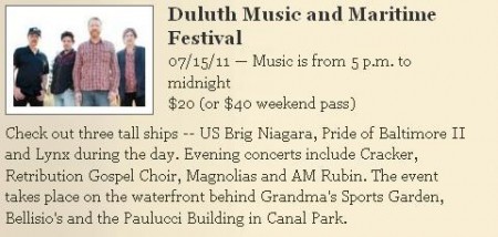
Should we show the descriptions like below?

* * *

* * *

That’s how we have it now. It means you don’t have to click the event title to get the description, but you have to scroll more to look at all the events.

Or, should we hide the descriptions like below?

* * *

* * *

With the descriptions hidden it’s easier to scroll through and find an event you’re interested in, then click for more info. But you have to click back and forth if there were several events you want info on.

It comes down to more scrolling, less clicking vs. more clicking, less scrolling. Consult your median nerve and vote:

This poll is now closed. The results were:

Show the descriptions — 55.3 percent
Hide the descriptions — 44.7 percent

So, how would you like the daily calendar pages to look?

Loading ... Loading ...

If you want to blabber about your answer, the comments are open. If you want to comment about the calendar, but not this specific element of it, please refer to the calendar intro post and comment there.

Some time in August we should have this thing running full throttle. And it probably bears mentioning again that there’s still two weeks to apply for the postion of PDD Calendar editor.

12 Comments

Vicarious

about 13 years ago

How about a compromise? What if the descriptions are hidden, but when you click for "more," it opens a pop-up thingy that isn't really a pop-up, but one of those things that darkens the rest of the page and shows the pertinent info in a box (I'm super technical). I think WordPress can do that.

That way, you can just close the box without having to go back to the event listing page. I think that would be neato and moderny.

Vicarious

about 13 years ago

Modern, neato blabber leads to tight, efficient design. Welcome to 2013!

Frank Nichols

about 13 years ago

Hate to say this, but I liked it the way it was.

ruby2sd4y

about 13 years ago

Perhaps you meant a 'mouse-over' pop-up window. That's my 'technical' suggestion anyway.

Another useful example would be something similar to the one here. When the site opens type in 55802 and from the drop-down menu choose: 
Duluth 
then: 
Basic. 
When the window opens click on any program for its description. Click the x to close the box. Later, rinse, repeat, as needed.

Vicarious

about 13 years ago

I don't know the technicalities/parlance. But, it's not mouse-over pop-ups to which I refer.

Rather, consider a hyperlink that opens a window/box instead of a whole new page. The new window/box is displayed "on top of" the original page without clicking past the original page.

I'm sure PDD's tech guy know of what I speak.

aiko

about 13 years ago

When the descriptions are shown, I am more interested.  I can simply scroll and see, and like not having to click on everything that MIGHT be interesting.

Barrett Chase

about 13 years ago

I probably shouldn't post this, but I'm a PDD user, too, dammit!

I went to see Cracker and enjoyed it. I've probably seen David Lowry about three or four times in my life, and still I would have no idea who the people are in that photo above. I probably wouldn't click on it unless I was really bored. 

"Music & Maritime Festival" doesn't tell you anything -- that could mean four crappy cover bands are playing in Canal Park. My vote is to show the descriptions.

Hollie

about 13 years ago

I tried to vote, but it wouldn't work for me, so I'll post my vote here.

I agree with Barrett.  I like seeing the descriptions.  It will, hopefully, keep me from missing an interesting event that might have a misleading or uninteresting title.

Bad Cat!

about 13 years ago

Oh, Vicarious' comment made me think of an idea (somewhere in Duluth Paul Lundgren rolls his eyes and thinks "No more ideas! Just bloody vote already!")!

What about a click dropdown description which expands the event description in-page? That way you can click once to expand the description, but you stay on the calendar page and can just scroll down when you're done reading the description (and you don't have to navigate back to the calendar page or close a popup window).

Vicarious

about 13 years ago

Bad Cat! described what I was mush-mouthily trying to describe, only much more clearly. Yeah, that thing.

adam

about 13 years ago

Reveal on click.

Paul Lundgren

about 13 years ago

What we're planning to do, since the vote on this was pretty split, is leave the descriptions on the page but jump the description (which will require a click) if it is longer than five lines, which in most cases it won't be.

Leave a Comment

Only registered members can post a comment , Login / Register Here